By fari | Interior Design Enthusiast & Decor Expert
There was a time when homes mostly followed a “beige everything” rule — quiet walls, safe sofas, and matching trims everywhere. But 2026 is flipping the script. Designers are turning up the emotion, choosing deep, soulful colors that don’t just fill a room — they bring it to life.
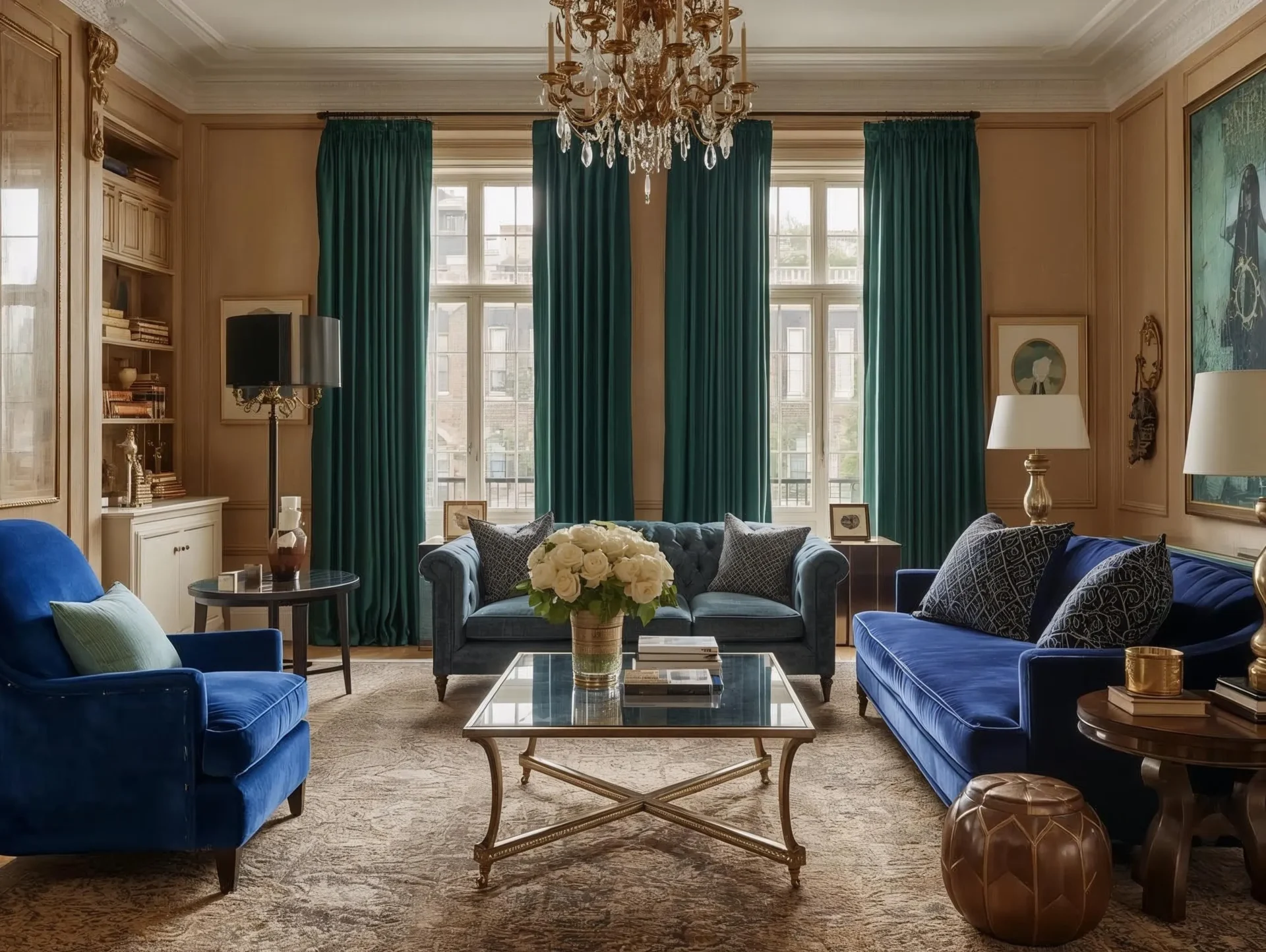
If you’re ready to break free from sterile neutrals, this year’s bold home decor color trends are for you. Think nature-rooted greens, rich jewel tones, cozy warm neutrals, and moody blue-greens. And yes — even painting entire rooms in one color (hello, color drenching). These trends are all about creating spaces that feel personal, grounded, and full of feeling.
Table of Contents
Key Takeaways
- Discover bold home decor color trends for 2026
- Nature-inspired greens, smoky jade, and jewel tones
- Warm neutrals like khaki for versatile styling
- Color drenching for a dramatic, cohesive look
- Easy ways to add bold colors to any space
Nature-Rooted Hues That Ground Your Space
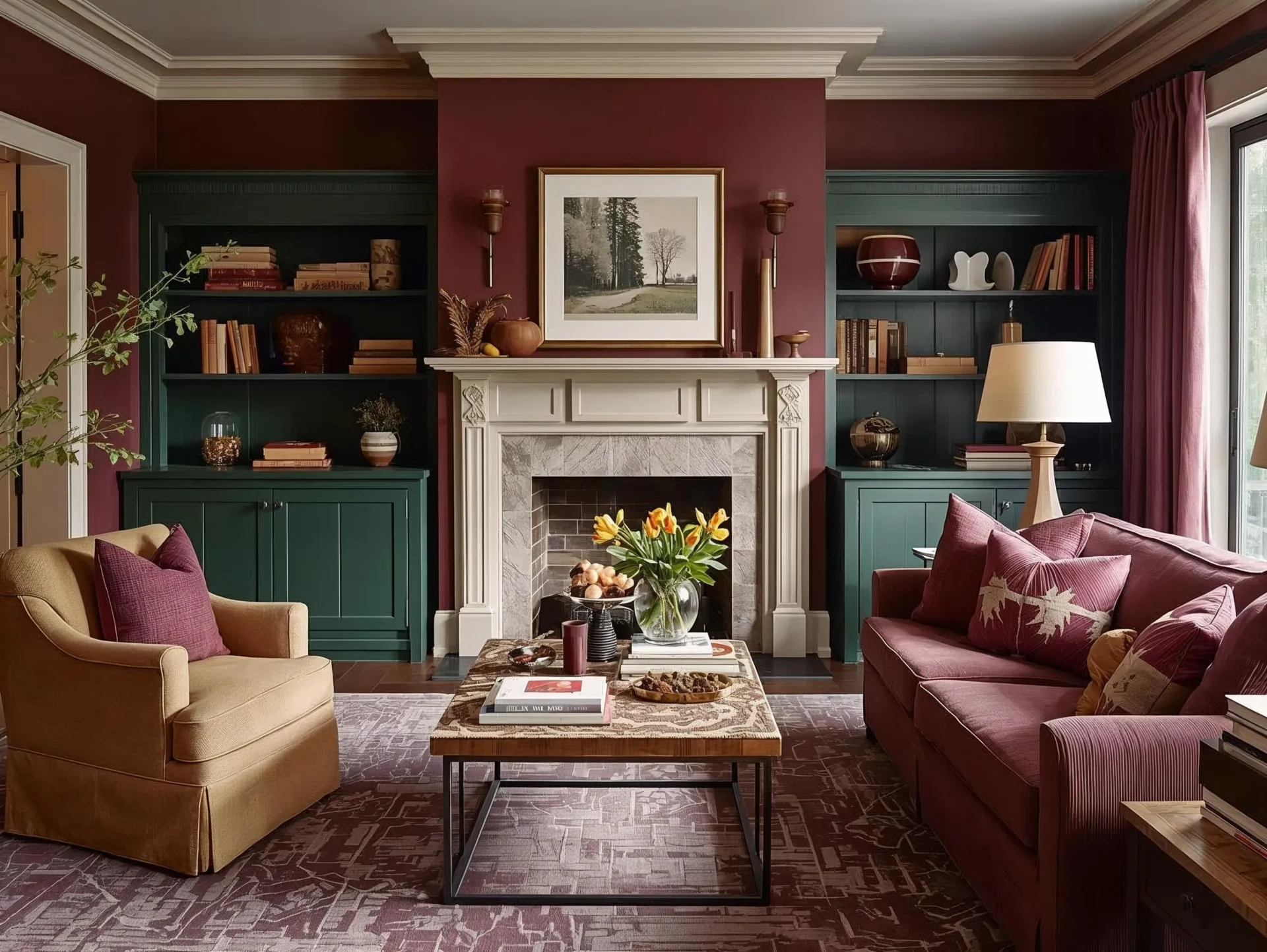
Greens are no longer just calming — in 2026, they’re bold and rich. Think forest, olive, and plum-like tones that connect your interior with nature. These nature-rooted hues bring warmth and depth without feeling too flashy.
How to use them:
- Use deep greens on cabinets, curtains, or even doors
- Add plum throws, moss-green pillows, or clay vases
- Combine these tones with natural materials like wood for a cozy, grounded vibe
Jewel Tones + New-Neutral Pairings
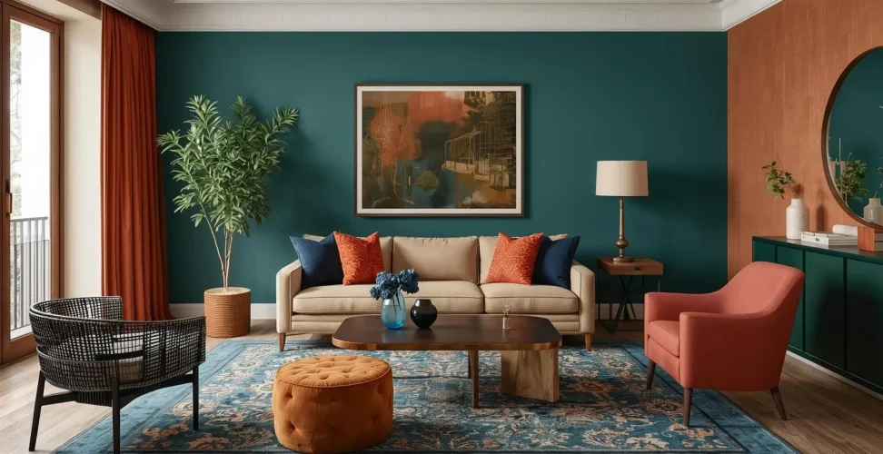
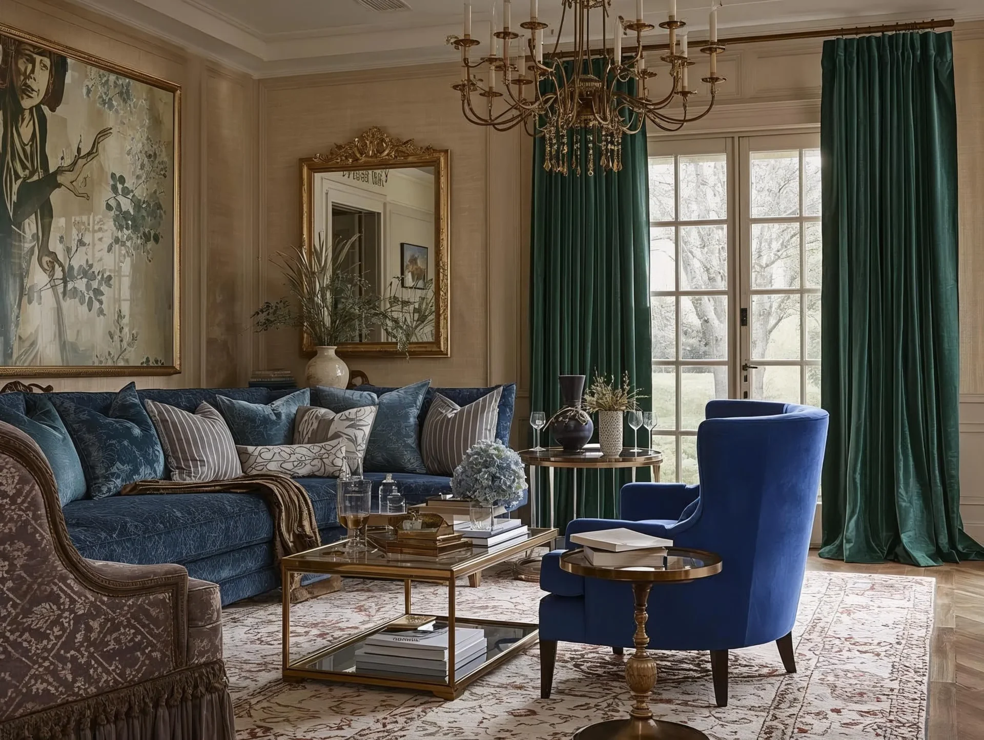
Jewel colors like sapphire blue, emerald green, and deep plum are no longer just “accent” colors — they’re becoming a relaxed luxury. Designers pair these rich hues with warm wood, brass, and soft neutrals to create a layered, elegant look.
How to use them:
- Try one statement piece: a sapphire armchair, emerald curtains, or a plum side chair
- Let the rest of the room stay calm with warm wood tones and muted walls
- Use warm neutrals (like khaki) to balance out the richness
Warm Neutrals Reimagined: The Rise of Universal Khaki
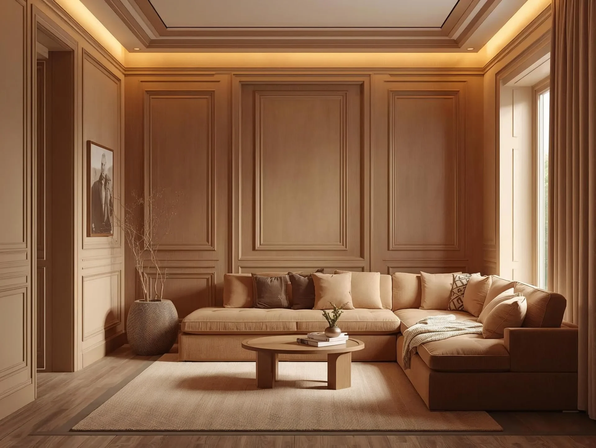
Not all neutrals are boring. Universal Khaki — an earthy, mid-tone tan — is becoming the new safe but stylish base. It’s warmer than white, but still clean and versatile.
How to use it:
- Paint trim, moldings, or ceilings in khaki instead of plain white
- Replace stark white lamps with camel or tan-colored designs
- Use khaki to soften metallic accents and highlight rich textures
Smoky Jade & Grounded Blue-Greens
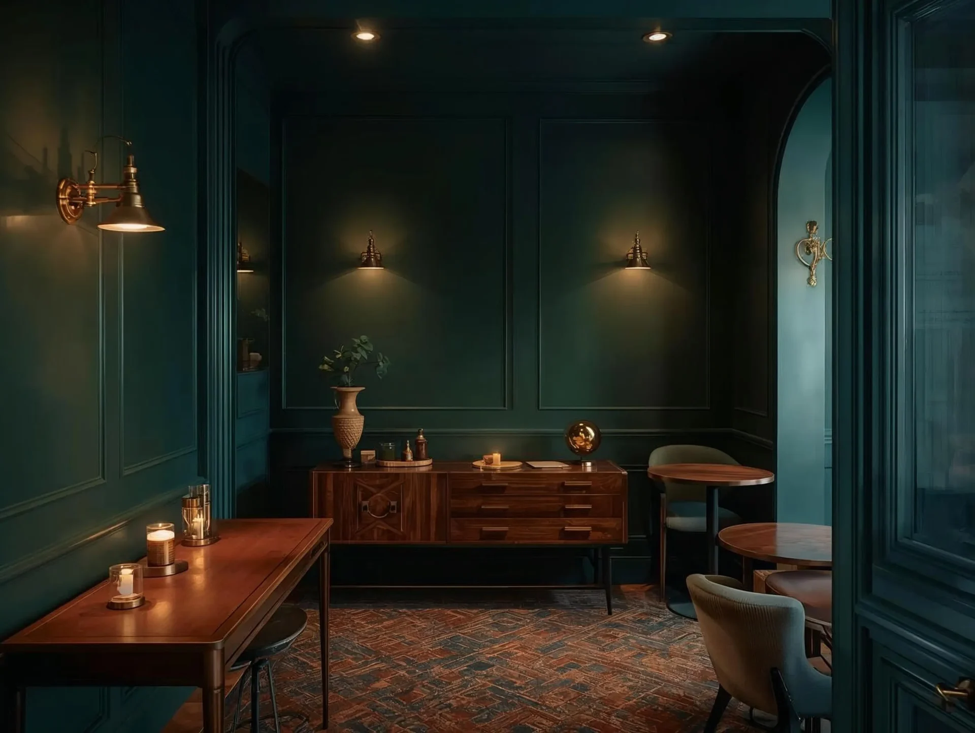
Smoky jade — a blue-green mixed with gray — is emerging as one of 2026’s most beloved bold colors. It’s calming, yet strong. Pair it with warm wood, brass, or natural textures for a balanced, elegant look.
How to use it:
- Use smoky jade on a feature wall or a kitchen island
- Add brass light fixtures or natural wood furniture for contrast
- Try “color drenching” (paint walls, trim, even ceiling in the same hue) for a fully immersive feel
Color Drenching: Boldness That Wraps Around You
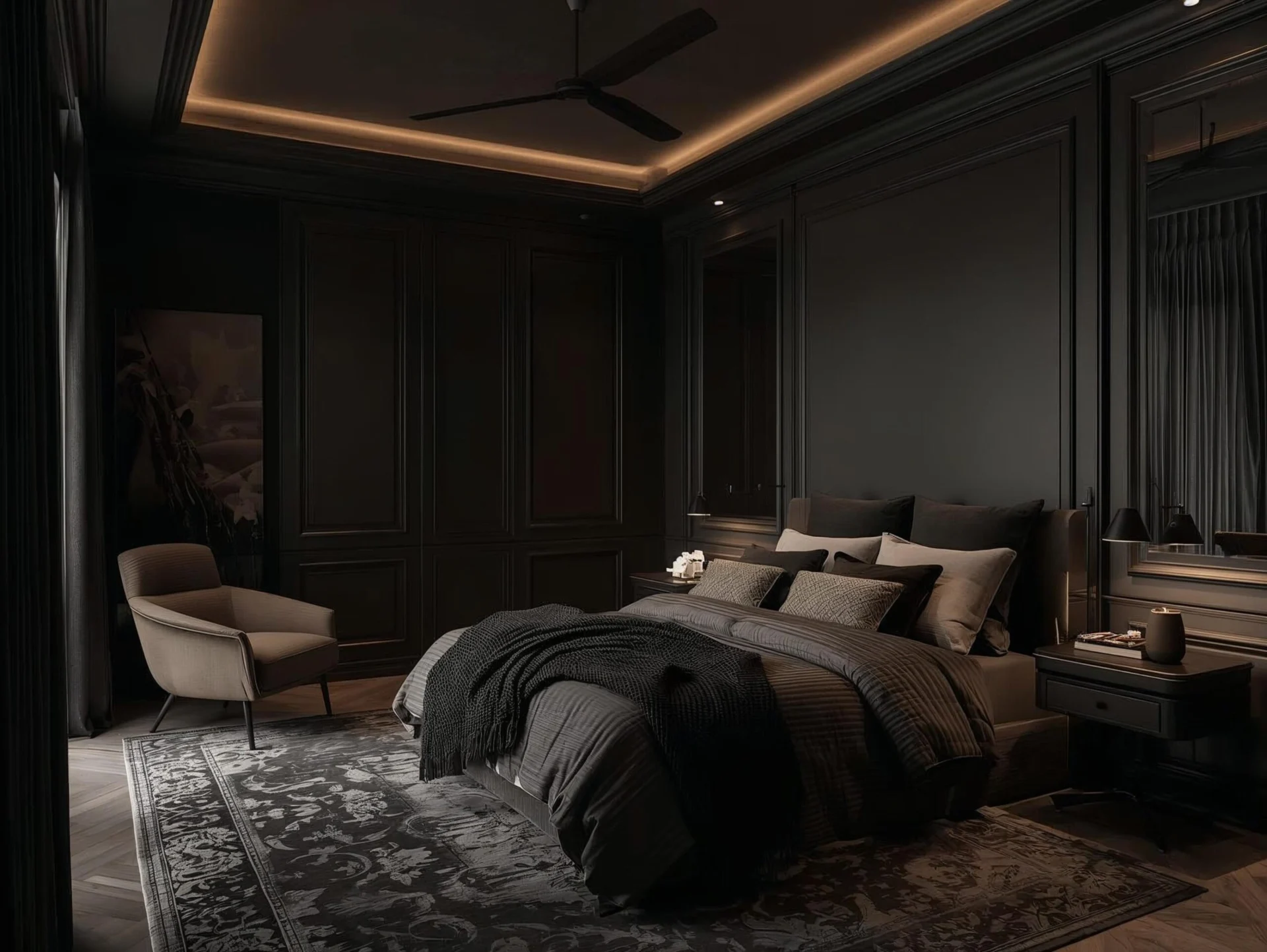
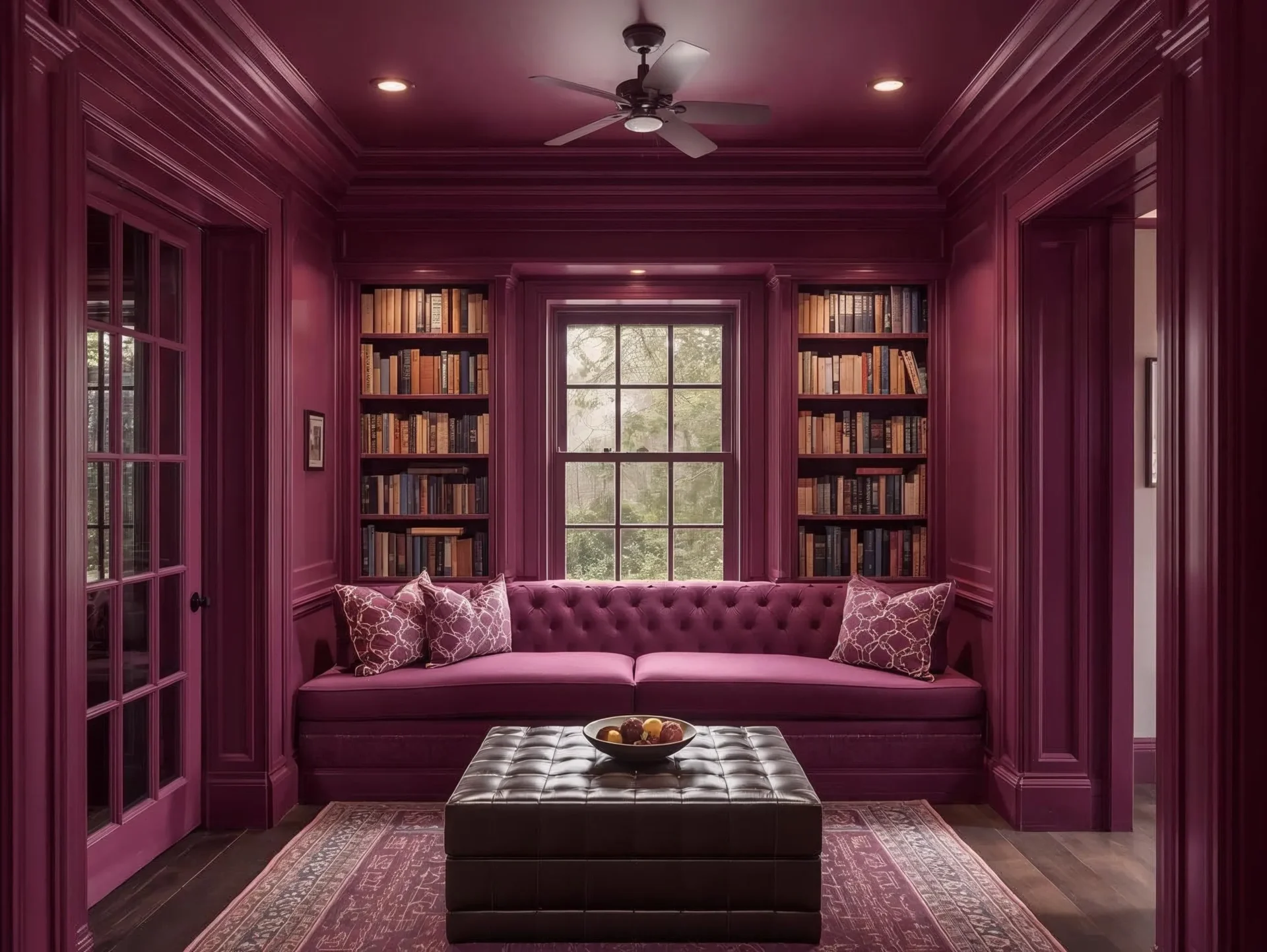
Color drenching means painting walls, ceiling, and even trim in one rich tone. It used to be bold — now it’s a growing trend that makes spaces feel more cohesive and enveloping.
Why it works:
- Using one shade everywhere creates visual flow and height
- It simplifies decor: when your room is “drenched” in color, you don’t need a lot of competing accents
- This approach makes a powerful statement without needing pattern overload
How to try it:
- Start with a smaller space like a reading nook or hallway
- Use woven baskets, wood shelves, or textured rugs to break up the monotony
- Choose a color you love — like plum, jade, or khaki — and commit
Conclusion
2026’s bold home decor color trends are all about emotion, richness, and personality. From nature-inspired greens and smoky jades to deep jewel tones and warm khaki, these hues bring a sense of life and warmth into your home. And when you go all-in with color drenching, your spaces don’t just look bold — they feel intentional, welcoming, and deeply personal. You don’t have to repaint your whole house. Even small touches — a painted door, a jewel-toned chair, or a warm neutral trim — can transform a room. So, trust your gut, pick a shade that makes you feel something, and let color do the rest.
FAQs
Q1: How do I choose which bold color trend is right for me?
Look at the materials you already have — your floors, furniture, and lighting. If your home has a lot of wood or brass, earthy greens or khaki will feel natural. For cooler surfaces like marble or concrete, smoky jade or jewel tones could work beautifully.
Q2: Will a bold color make my small room feel smaller?
Not necessarily. With color drenching, a single hue can actually make a room feel more cohesive and taller. Use matte finishes, mirrors, and metallic accents to keep the space open and balanced.
Q3: I rent — can I still try these bold color trends?
Yes! You don’t need to paint your walls. Use bold color through furniture or decor — like a sapphire chair, a jade lamp, or a khaki throw. These pieces bring the same impact without changing the structure of your space.
Love styling your space? Explore our latest home design trends that mix color, texture, and style effortlessly.
Explore More Ideas
Check out our other articles on HomefulSpell for more inspiration and dynamic spaces!

